Before Tufte, there was Bertin
Jacques Bertin and the Graphic Sign-System

Semiology of Graphics, Jacques Bertin’s remarkable book about information graphics, predates Edward Tufte’s The Visual Display of Quantitative Information by sixteen years. Well before Tufte introduced us to “chartjunk” and “sparklines,” French cartographer and theorist Bertin described the contours of his “Graphic Sign-System,” an early theoretical framework for designing and evaluating information graphics. Fifty years later, the strength of this framework has been matched by few (e.g., Tukey, Cleveland, Wilkinson) and read by even fewer.
Semiology of Graphics is intimidating, but if it’s dense, it’s also chock-full of theoretical goodness. Let’s explore just a few concepts and highlights from Semiology of Graphics that provide useful structure for creating and evaluating information graphics, even today.
The Structure of a Graphic
Writing in 1967, Bertin focused on flat, static information graphics. Fifty years of transformational technology have done little to change this paradigm—our work remains bound to the two-dimensional planes of paper and screens. In this light, there are two critical ingredients to any graphic: the visual mark or implantation itself (for example, a dot on a scatter plot graph) and its position on the plane (where the dot is placed relative to the x-axis and y-axis that bounds the graphic).
At the other end of the spectrum, the idea, concept, or topic that unifies all visual marks—that which is graphed—is the invariant. Bertin calls the variable features that constitute the invariant components. These components themselves then consist of different, atomic parts called elements. Consider this remarkable graph of gun sales in America (from The New York Times):

Here, the invariant (topic) is “estimated gun sales in America since 2000”—the overarching content of the graphic. Its components are a variation in sales and a variation in time. Its elements are estimated gun sales at each given month. Note the relationship between the invariant and the title of the graphic, between the components and the axes and planar space of the graphic, and the elements and the visual implantations (marks).

Levels of Organization
Components themselves are organized on one of three levels:
- Quantitative: Component consists of elements with constant numerical ratios between one another, like a sequence of minutes.
- Ordered: Component consists of elements with a natural sequence, like cold-warm-hot or white-gray-black.
- Qualitative: Component consists of associated and differentiated groups, yet has no inherent order, like a list of the fifty states in America. Useful: as qualitative components have no inherent order, they can be arbitrarily re-ordered to reveal patterns in the data.
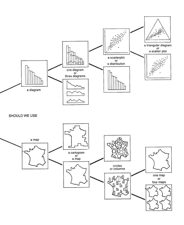
For Bertin, understanding the nature of the components within the graphic can help guide both the design of the graphic and the selection of which graphic form to use. As Bertin was designing a system for sign-making, his suggestions for graphics with different components are exceedingly proscriptive—for example, the fundamental forms for graphics with two components:

Constructing a Graphic
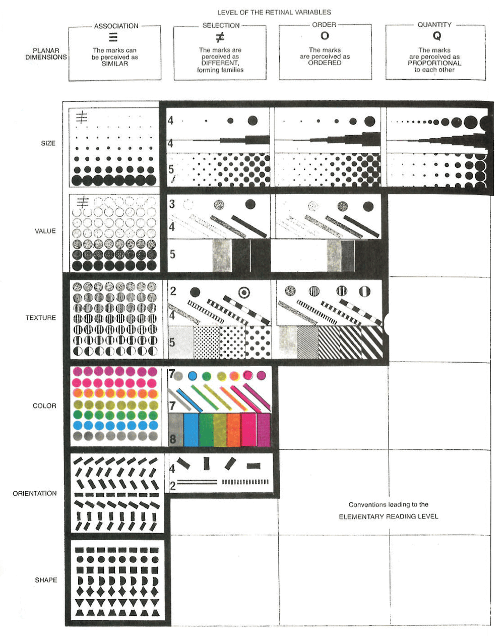
We’ve already established that the planar space of graphics is fundamental. Within this framed space, the reader can trust certain expectations—every mark in the graphic is significant, as is the absence of a mark, for example. Beyond the x-y position of an implantation, Bertin illustrates the six visual variables that we can apply to make this implantation: size, value, pattern, color, orientation, and shape.

Here and elsewhere, Bertin highlights some important concepts for mapping information to graphics:
- Relative size is the most widely useful and easily perceived visual variable, no matter what information is visualized.
- Size and planar position are the only variables that can accurately communicate quantitative information.
- For communicating order, value (from light to dark) is far superior to color (from one color to another).
- Color, orientation, and shape function best when creating visual associations and building visual groups.
- Ideally, the graphic should balance white space with 5%-10% ink.
- Focusing on fewer components in a graph aids memorization and allows freedom to use more exotic graphic forms.
Reading the Graphic
Finally, Bertin offers guidance for evaluating the success of a graphic as an efficient vehicle for transmitting information. Let’s start with the three stages of reading a graphic:
- External: From all the information that exists in the world, what information is represented in the image? The reader’s eye looks to the title and axis labels—or to see what are the invariant and components of the graph. To revisit the gun sales graphic, we read “sales of guns in America, over a period of time.”
- Internal: Now our eyes turn to the image itself. What visual variables are used to represent the components in the graphic? In the gun sales graphic, we see a red line against a light gray grid.
- Relationships: Finally, the mind makes connections between these elements. How are these components related? What questions can I ask of this graphic? What can I learn?

Bertin, obviously a fan of the rule of three, then describes the three questions a graphic should answer:
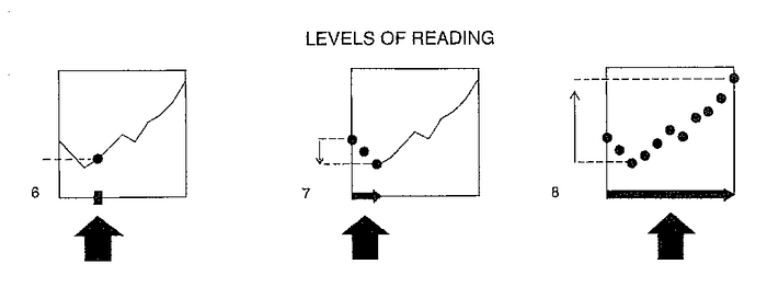
- Elementary: An elementary question focuses on a specific element of the graphic. In our gun sales graph: “How many guns were sold in January of 2013?” The reader can cross the two axes—or read the annotation—to see that two million guns were sold that month.
- Intermediate: An intermediate question focuses on a group of elements and usually illuminates a trend. “What’s the trend in gun sales since President Obama was elected?” Sadly, it’s accelerating.
- Overall: The overall question seeks an answer to the general message of the graphic. “What’s the overall trend in gun sales in America since the year 2000?” Overall, gun sales have been increasing and demonstrate spikes in conjunction with certain events.

A graphic that can answer all three questions with one image—elementary, intermediate, and overall — is called efficient by Bertin. Anything less is, well, a lesser graphic. Efficiency answers any question at every level, which enables the reader to perceive patterns, and therefore, create the output that we so desperately crave: knowledge.
If you’re a practicing information graphic designer, take this structure to heart, even if it’s not the Holy Gospel. Although our pinch-to-zoom, hover-state, animated, details-on-demand world makes more room for creative answers, Bertin’s framework offers a robust framework for your work:
- Struggling to get started? Have you identified the invariant, components, and elements of your graphic?
- Are the invariant and components clearly labeled for readers?
- Are ordered and quantitative components intuitively ordered? Are qualitative components re-ordered to reveal patterns?
- Does the visual mapping make the most efficient use of the six visual variables?
- Does the graphic allow answers to all three types of questions?
With a little effort, you’ll be speaking the language of Semiology of Graphics in no time at all.
Enjoy this post? Great! Share it with your friends, follow me on Twitter, and check out my previous post about my favorite books about information graphics not by Edward Tufte:
